
All work
Pako
2026
Product Design
Mobile App
Mental Health

Role
Lead Product Designer\nFull-scope: naming → launch

Tools
Figma · FigJam · Notion · Principle
Deliverables
Brand identity · Design system\nUX architecture · 40+ screens

[ 01 ] The Opportunity
Mental health apps often feel clinical. Pako needed to feel like a friend.
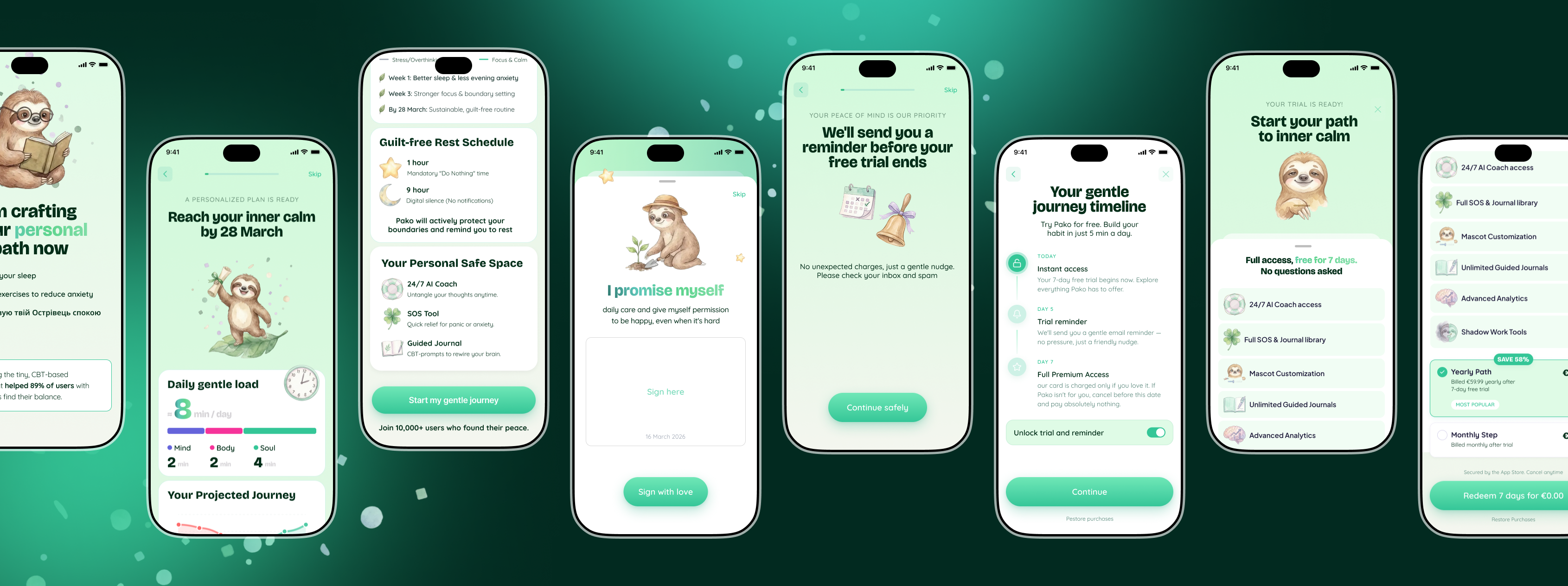
The founders came to me with a clear mission but no product: build a mental health companion for young adults that doesn't feel like a therapy worksheet. The market is flooded with apps that are either too gamified to be taken seriously, or too clinical to be used daily.
The core challenge was designing for vulnerability — creating an experience that people would actually open during a hard moment, not shelve after day three.
"We don't want another habit app. We want something that makes people feel less alone at 2 am."
— Founding team brief
[ 02 ] Approach
Starting with people, not pixels
Before opening Figma, I spent three weeks deep in research. I conducted 11 user interviews with adults aged 19–32 who had tried and abandoned mental health apps, analysed 6 top competitors, and mapped emotional journey patterns around anxiety, loneliness, and daily stress.
The most consistent finding: people don't want to be measured, they want to be heard. This single insight drove every design decision that followed.
Step 01
Research
11 user interviews, competitor audit, and emotional journey mapping across 3 weeks.
Step 02
Naming & Identity
Brand naming workshops, tone of voice guidelines, and a visual identity system rooted in warmth.
Step 03
UX Architecture
Information architecture, user flows, low-fi wireframes, and prototype testing with 8 participants.
Step 04
Design System
Component library, colour tokens, typography scale, motion guidelines, and dark/light modes.
[ 03 ] Solution
Warm, honest, and genuinely useful
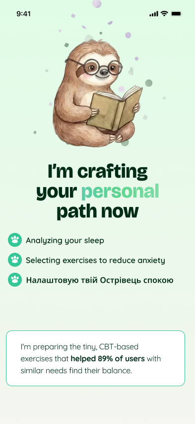
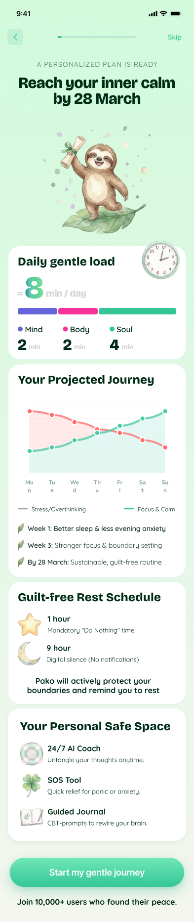
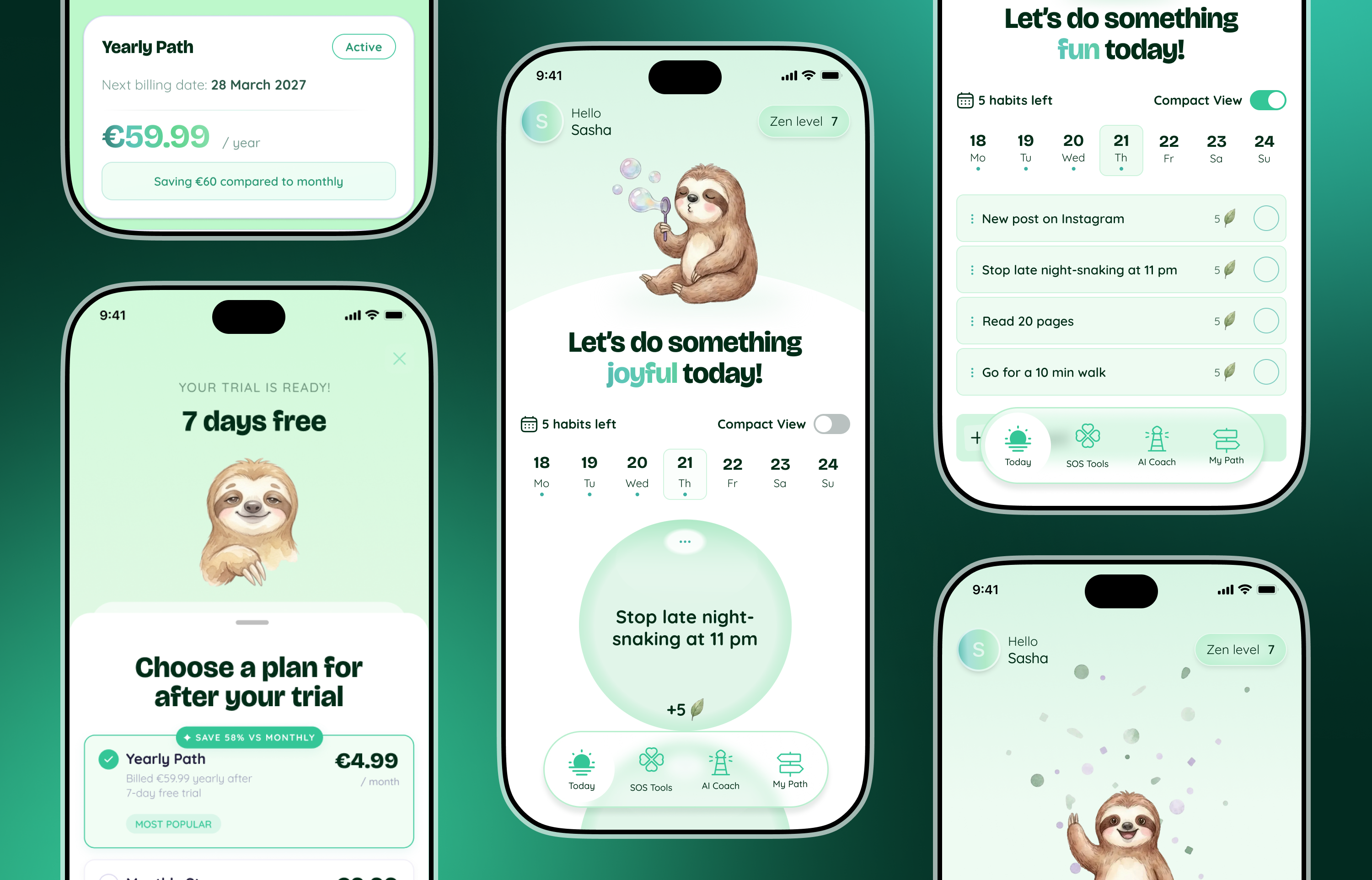
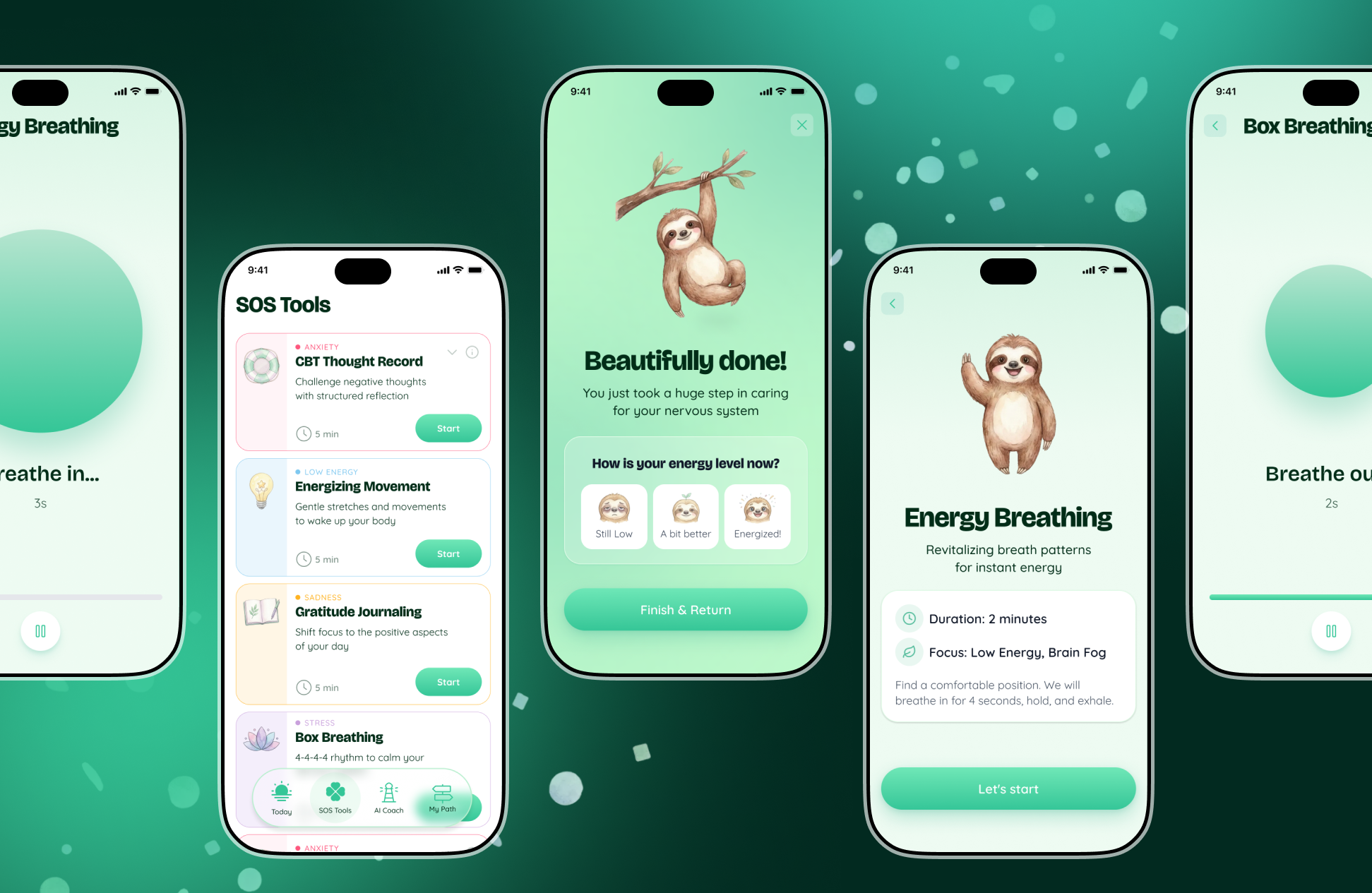
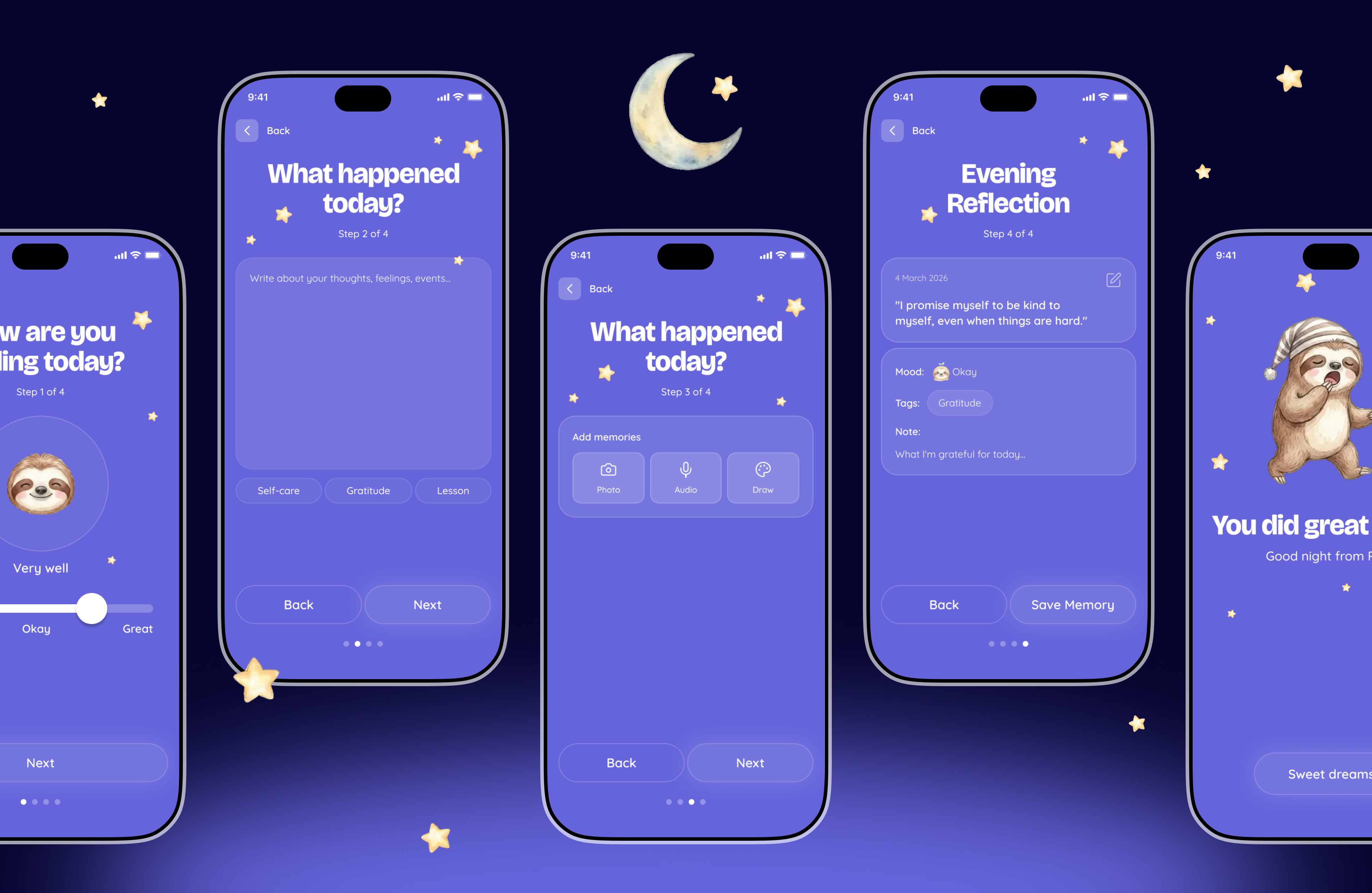
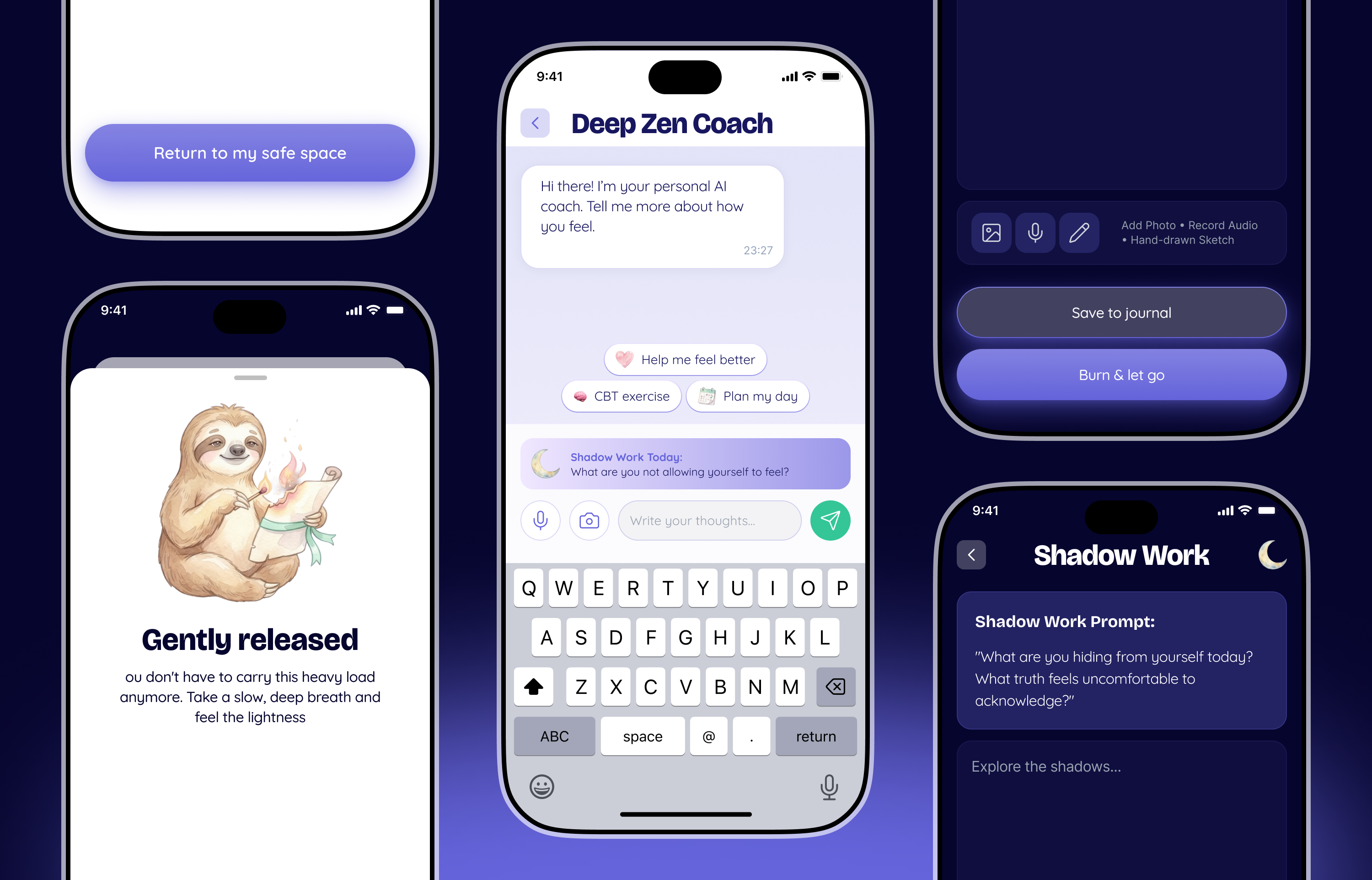
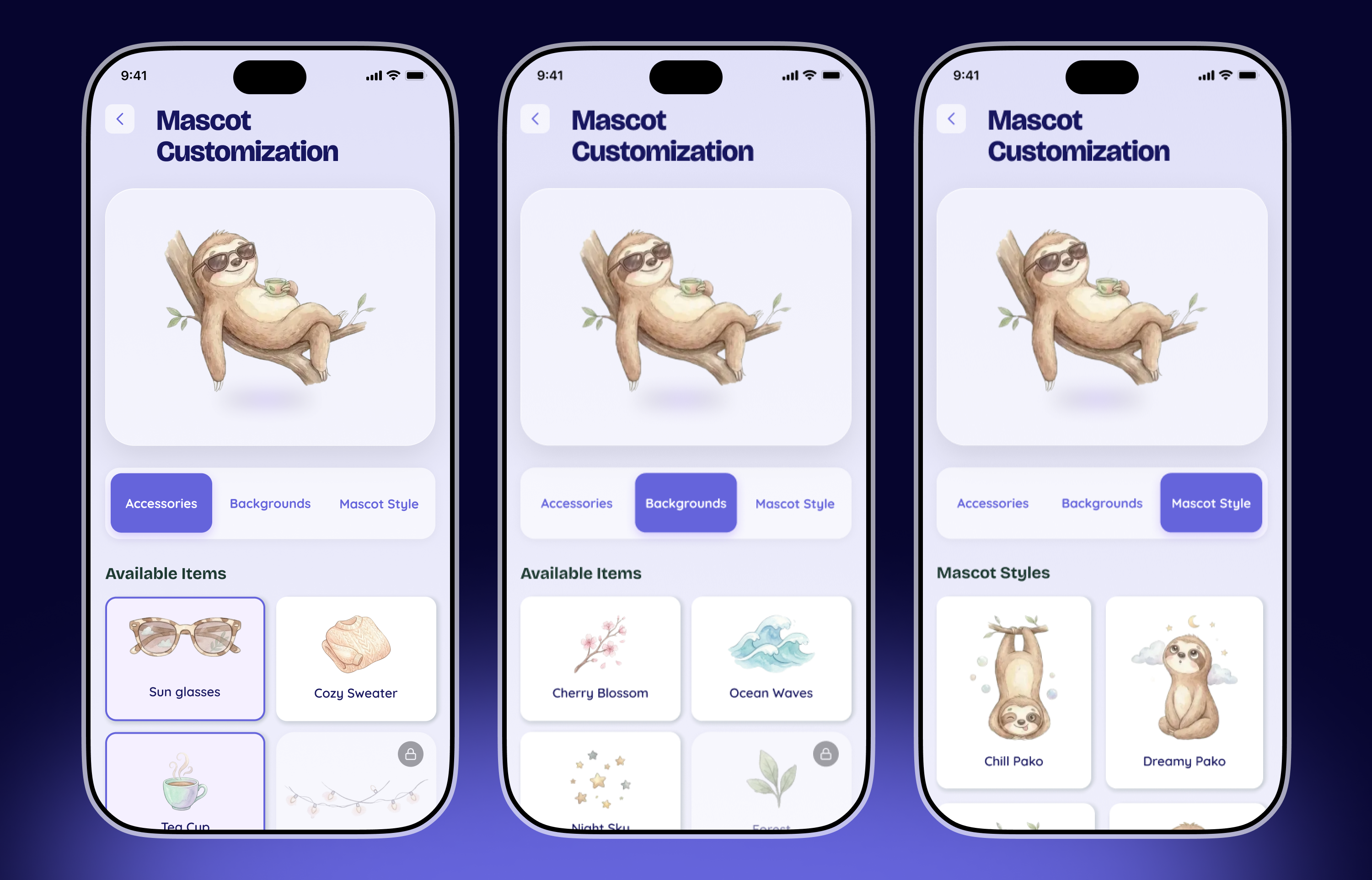
Pako (from the Basque word for "friend") was born as a companion, not a coach. The interface leans on soft, organic shapes and a muted palette to create a sense of calm. Interactions are intentionally slow and deliberate — no streaks, no push notifications asking how you feel, no gamification points.
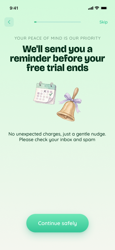
The subscription model was designed around a freemium core that gives genuine value: daily check-ins, a mood log, and a library of short guided exercises are free forever. Premium unlocks personalised journeys and 1:1 practitioner access — framed as growth, never as a wall.
[ 04 ] Results
Numbers and the feeling
behind them
Pako launched to a closed beta of 400 users in September 2023. The product team used the design system I delivered to ship new screens 40% faster than their previous project. The subscription conversion rate in beta exceeded the industry benchmark by 1.8×.
But the metric that mattered most: 68% of beta users opened the app three or more times in the first week — without a single push notification.
68%
Day-7 retention
Users returning 3+ times in the first week without any push prompts.
40%
Faster shipping
Engineering team velocity using the component library vs. previous project.
1.8×
Subscription CVR
Beta conversion rate versus the mental-health app category benchmark.
[ 05 ] Learnings
What this project taught me
Designing for emotional vulnerability means resisting every instinct to add. Fewer prompts. Fewer features. Fewer choices at the moment someone needs to breathe. The hardest design decisions on Pako were the ones where we chose to remove something.
I also learnt that naming is design. The word "Pako" — short, warm, memorable — shaped the entire visual and interaction language before a single frame was drawn. I now start every brand project with naming.
← Previous
All Cases
Next →
Zenlook
Mail me for collaboration
sasha.designer@outlook.com ↗

Big ideas start with a hello
Sasha Savchenko
KYIV, Ukraine: 7 pm
Designed by me. Obviously.
Available for work
Portfolio
email me

All work
Pako
2026
Product Design
Mobile App
Mental Health
Role
Lead Product Designer
Full-scope: naming → launch
Tools
Figma · FigJam
Notion · Principle
Deliverables
Brand identity · Design system
UX architecture · 40+ screens

[ 01 ] The Opportunity
Mental health apps often feel clinical. Pako needed to feel like a friend.
The founders came to me with a clear mission but no product: build a mental health companion for young adults that doesn't feel like a therapy worksheet. The market is flooded with apps that are either too gamified to be taken seriously, or too clinical to be used daily.
The core challenge was designing for vulnerability — creating an experience that people would actually open during a hard moment, not shelve after day three.
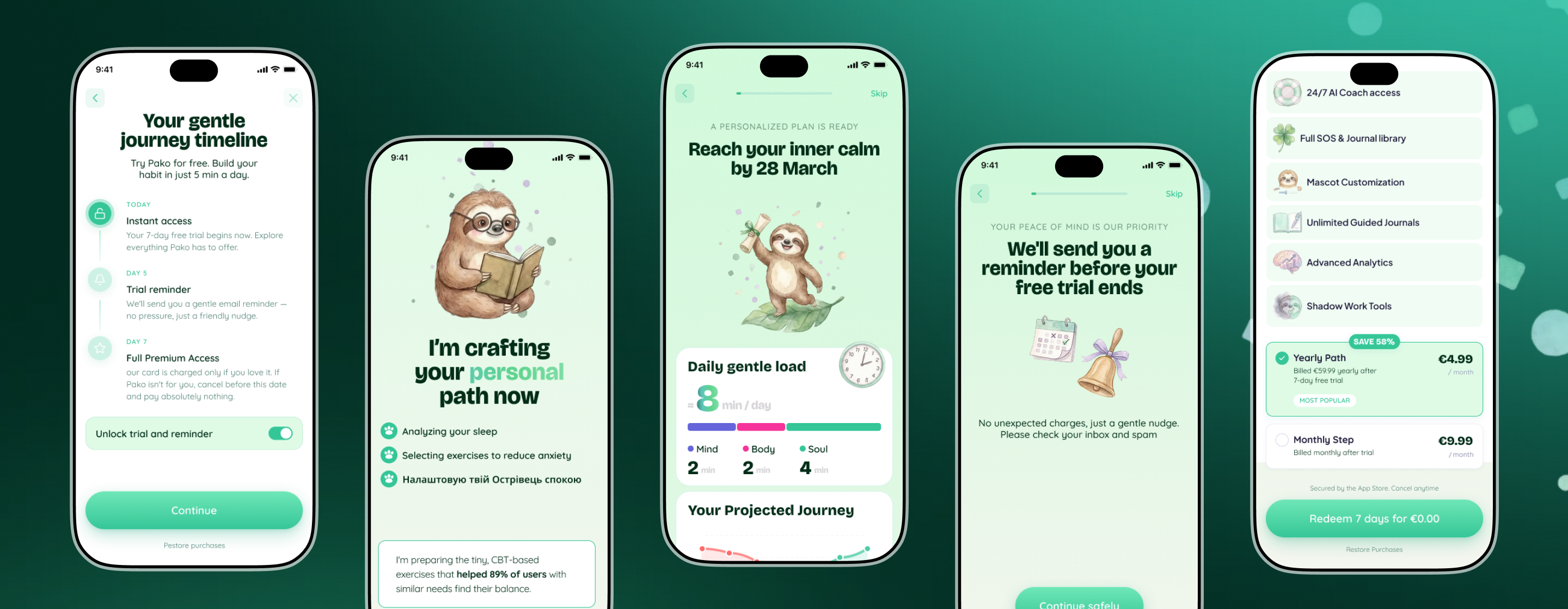
On top of the experience design, the startup needed a complete product identity from scratch: a name that resonates, a visual system that scales, and a monetisation model that doesn't betray user trust.
"We don't want another habit app. We want something that makes people feel less alone at 2 am."
— Founding team brief
[ 02 ] Approach
Starting with people, not pixels
Before opening Figma, I spent three weeks deep in research. I conducted 11 user interviews with adults aged 19–32 who had tried and abandoned mental health apps, analysed 6 top competitors, and mapped emotional journey patterns around anxiety, loneliness, and daily stress.
The most consistent finding: people don't want to be measured, they want to be heard. This single insight drove every design decision that followed.
Step 01
Research
11 user interviews, competitor audit, and emotional journey mapping across 3 weeks.
Step 02
Naming & Identity
Brand naming workshops, tone of voice guidelines, and a visual identity system rooted in warmth.
Step 03
UX Architecture
Information architecture, user flows, low-fi wireframes, and prototype testing with 8 participants.
Step 04
Design System
Component library, colour tokens, typography scale, motion guidelines, and dark/light modes.
[ 03 ] Solution
Warm, honest, and genuinely useful
Pako (from the Basque word for "friend") was born as a companion, not a coach. The interface leans on soft, organic shapes and a muted palette to create a sense of calm. Interactions are intentionally slow and deliberate — no streaks, no push notifications asking how you feel, no gamification points.
The subscription model was designed around a freemium core that gives genuine value: daily check-ins, a mood log, and a library of short guided exercises are free forever. Premium unlocks personalised journeys and 1:1 practitioner access — framed as growth, never as a wall.
[ 04 ] Results
Numbers and the feeling
behind them
Pako launched to a closed beta of 400 users in September 2023. The product team used the design system I delivered to ship new screens 40% faster than their previous project. The subscription conversion rate in beta exceeded the industry benchmark by 1.8×.
But the metric that mattered most: 68% of beta users opened the app three or more times in the first week — without a single push notification.
68%
Day-7 retention
Users returning 3+ times in the first week without any push prompts.
40%
Faster shipping
Engineering team velocity using the component library vs. previous project.
1.8×
Subscription CVR
Beta conversion rate versus the mental-health app category benchmark.
[ 05 ] Learnings
What this project taught me
Designing for emotional vulnerability means resisting every instinct to add. Fewer prompts. Fewer features. Fewer choices at the moment someone needs to breathe. The hardest design decisions on Pako were the ones where we chose to remove something.
I also learnt that naming is design. The word "Pako" — short, warm, memorable — shaped the entire visual and interaction language before a single frame was drawn. I now start every brand project with naming.

Designed by me. Obviously.
Mail me for colaboration
Big ideas start with a hello
Sasha Savchenko
KYIV, Ukraine: 7 pm
linkedin >>
instagram >>
behance >>
whatsapp >>
